Introduction
Creating a seamless and engaging user experience (UX) along with an intuitive user interface (UI) is essential in today’s digital age. Whether you’re a student aspiring to be a design professional or a seasoned developer, understanding and avoiding common UI/UX mistakes can elevate your projects to new heights. Let’s dive into some key strategies to help you create outstanding designs.
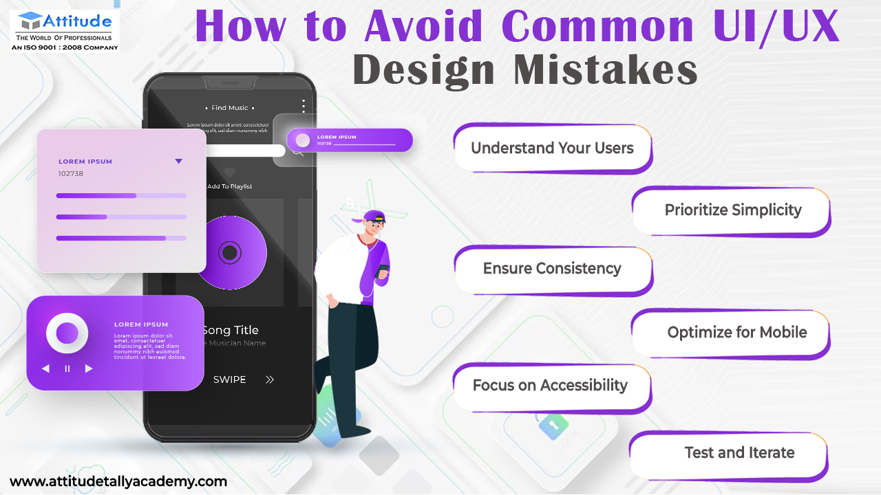
- Understand Your Users
The foundation of any successful UI/UX design is a deep understanding of the end users. Conduct thorough research to learn about their needs, preferences, and behaviors. Use surveys, interviews, and analytics to gather insights. By knowing your users well, you can tailor your design to meet their expectations, ensuring a more intuitive and enjoyable experience.
- Prioritize Simplicity
In the world of UI/UX design, simplicity is king. Avoid cluttering your interface with too many elements. Stick to a clean and minimalistic design that allows users to navigate effortlessly. Remember, each element on your screen should serve a purpose. Prioritizing simplicity not only enhances usability but also makes your design more aesthetically pleasing.
- Ensure Consistency
Consistency in design is crucial for creating a cohesive user experience. Use consistent colors, fonts, and design elements throughout your project. This helps users quickly become familiar with your interface, reducing the learning curve and preventing confusion. Consistent design also reinforces your brand identity, making it more recognizable and trustworthy.
- Optimize for Mobile
With the increasing use of smartphones, optimizing your UI/UX design for mobile devices is non-negotiable. Ensure your design is responsive, adapting seamlessly to different screen sizes and orientations. Pay attention to touch interactions, font sizes, and loading times to provide a smooth experience on mobile devices. A mobile-friendly design can significantly boost user engagement and satisfaction.
- Focus on Accessibility
Designing with accessibility in mind ensures that your product can be used by as many people as possible, including those with disabilities. Follow accessibility guidelines, such as providing alt text for images, using sufficient color contrast, and enabling keyboard navigation. By making your design accessible, you not only comply with legal standards but also demonstrate inclusivity and empathy towards all users.
- Test and Iterate
Testing is an integral part of the design process. Conduct usability tests to identify any issues or pain points in your design. Gather feedback from real users and use it to make informed improvements. Remember, design is an iterative process. Continuously refining your design based on user feedback ensures that you stay aligned with their needs and preferences.
Conclusion
By understanding your users, prioritizing simplicity, ensuring consistency, optimizing for mobile, focusing on accessibility, and continuously testing and iterating, you can avoid common UI/UX design mistakes and create exceptional user experiences. Keep these UI/UX design tips in mind as you work on your next project to ensure it stands out and delivers value to your users.
Embrace these practices, and you’ll be well on your way to becoming a UI/UX design expert, creating designs that are not only functional but also delightful to use. Happy designing!
Suggested Links: –


