Designing a postcard can really be a hectic task for any marketer, particularly when it’s about creating promotional prospects. You usually have two options: outsourcing the task or creating the design with your own skills.
If you decide to create the design at your end, this article will help you make a clean and appealing design for your next promotional postcard. It will also introduce you with every step to find suitable material and tools that you can use to design your final product.
Step 1
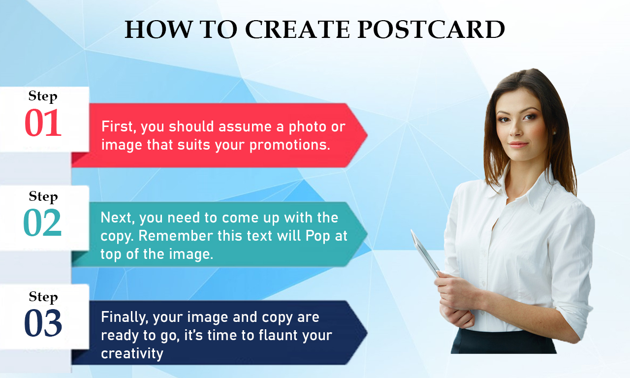
First, you should assume a photo or image that suits your promotion. This is the easy part (auto loan = mortgage, car, loan = house, etc.). searching a copyright free image that reflects what you want to promote. However, if your company already has a collection of images that can be effective in promotion then it is icing on the cake .
Step 2
Next, you need to come up with the copy. Remember this text will Pop at top of the image you decided on, so make it attractive and simple. Let that attractive image you designed well do most of the work for you. You need to try and write your main idea across in two lines or less. It’s important to remember what we’re promoting here. With a postcard, we wish to drive increase traffic in our branches, traffic on our websites or engage phone calls.
Here we would recommend coming up with an attractive one-liner that includes the core of the promotion and then a short section adding the actual deal for the back part of the postcard. Writing a suitable and appealing one-liner is not an easy task, but there are tricks you can take to castle your writer’s block.
Try to write down 25 various options/versions of what you want to say. We know, that sounds like very difficult, but don’t try to make them all perfect or even good. This is just is to help you imagine. You may come up with one you like or find out what you are averse to. Either way you’re learning the creative skills.
Step 3
Finally, your image and copy are ready to go, it’s time to flaunt your creativity. If you’re afraid you don’t have the artistic skills, don’t worry. There are a many easy tricks and tools you can use in designing your masterpiece with little creative energy needed.
First, you are required to open a program that allows you to design your photo and apply copy. The most common choice for this Adobe Photoshop. Since Photoshop needs a paid license for use and at least some basic knowledge of the program, you may have to take a different option. That being said, for trying having the experience I’m going to use Photoshop to design my final product. In case you don’t have access, there are other online programs you may try to create similar results.
with Photoshop, here are the steps we can take to edit our image:
- when you open Photoshop, go to File –> Open and find your image. The image will import as a Background Layer firstly, try double click on that and it will change it from a locked background to Layer 0 (which is what you need). The Layers panel should be placed at the bottom right hand of your screen.
- by now you should have your image, you’ll want to resize the canvas to the fix postcard dimensions. You may do this by going to Image –> Canvas Size and change the height and width. Then we are only required to resize the image so it fits inside our fixed canvas size.
Trick: clicking Command + T (or Control + T if you are using a Windows computer) will enable you to resize the image and if you hold the Shift key as you change the size, the image will remain in its original dimensions and not distort.
- you should add your copy now. with the use of Type tool, located at the left-hand toolbar, now you may click anywhere on the photo and start typing. now you also have the assistance to change the font, size, color, and spacing of your copy to fit whatever you think promotes your idea the best. For this postcard.
- The postcard stands out, but because we’re already in Photoshop there are other things, we may choose to design it even cleaner. look of Black & White images are always appealing. If you try this, they’re pretty simple to make. Just keep it in mind you have your Layer 0 selected and go to Images –> Adjustments –> Hue/Saturation and fix the Saturation all the way down to -100.
In Adjustments tab, there are different techniques you can give a go to increase the image further. You can always use the Brightness/Contrast option to help make the image a little less flat. Here is the result:
Some key points to remember:
- Remember to size your postcard appropriately and use the correct margins for your company’s print provider.
- select any branding guides your company might have. Try company colors and logos to make the postcard a professional.
- .
- When you are in doubt, think simple but key design principles like alignment, contrast, and balance.


